People has been commenting on the Google Chrome’s User Interface refreshing – a fresh start from sketch. Some says it is more like a runtimes or OS. Meanwhile, the iTunes 8 came out, with some two new features – new album view and genius. I observe one thing in common – the recycling of UI strategy with twists.
Google Chrome’s tab feature is just like any tab feature in Firefox, Opera or Safari. Yet, by isolated each tab in their protected space – the tab is not just a tab for different webpage but web-application container, you “launch” new app in the tab, and move it away, creating new windows – all these are Operation System strategies. Google recycled a UI and twist to make its own OS basic units – we get a Application manager and a Finder.
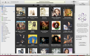
iTunes 8’s new album view is a grid arrangement by category: album, artists, genre… One can quickly skim through what is inside each picture. In Mac terminology, a picture is the representation of an event. In case of sorting by artists, the particular album cover will be presentaton of all ablums you have for artist in your music library. The Mac user will immediately spot the similarity with iPhotos event. You can resize the album Even the sizing bar is the same. The best of iTune 8 implementation involves the small cycle-number indication on the number of new heard downloads (when in Podcast). This cycle-number reminder is not new either, a direct take from the Mail (OS X’s dock or iPhone). Apple has essentially adopted the visual management strategy for the audio management. When the UI element or strategy is good, I don’t mind it appears again and again.

iTunes 8 screen capture
Background reading: Straight out of Compton.
iTunes 8 & Google Chrome UI
People has been commenting on the Google Chrome’s User Interface refreshing – a fresh start from sketch. Some says it is more like a runtimes or OS. Meanwhile, the iTunes 8 came out, with some two new features – new album view and genius. I observe one thing in common – the recycling of UI strategy with twists.
Google Chrome’s tab feature is just like any tab feature in Firefox, Opera or Safari. Yet, by isolated each tab in their protected space – the tab is not just a tab for different webpage but web-application container, you “launch” new app in the tab, and move it away, creating new windows – all these are Operation System strategies. Google recycled a UI and twist to make its own OS basic units – we get a Application manager and a Finder.
iTunes 8’s new album view is a grid arrangement by category: album, artists, genre… One can quickly skim through what is inside each picture. In Mac terminology, a picture is the representation of an event. In case of sorting by artists, the particular album cover will be presentaton of all ablums you have for artist in your music library. The Mac user will immediately spot the similarity with iPhotos event. You can resize the album Even the sizing bar is the same. The best of iTune 8 implementation involves the small cycle-number indication on the number of new heard downloads (when in Podcast). This cycle-number reminder is not new either, a direct take from the Mail (OS X’s dock or iPhone). Apple has essentially adopted the visual management strategy for the audio management. When the UI element or strategy is good, I don’t mind it appears again and again.
iTunes 8 screen capture
Background reading: Straight out of Compton.